Bupa Australia
myBupa Extras Cover Usage Redesign
Redesigned the Extras usage and Remaining limits experience for Bupa Customers
Digital Experience Designer at Bupa, 2016 to 2019

Background
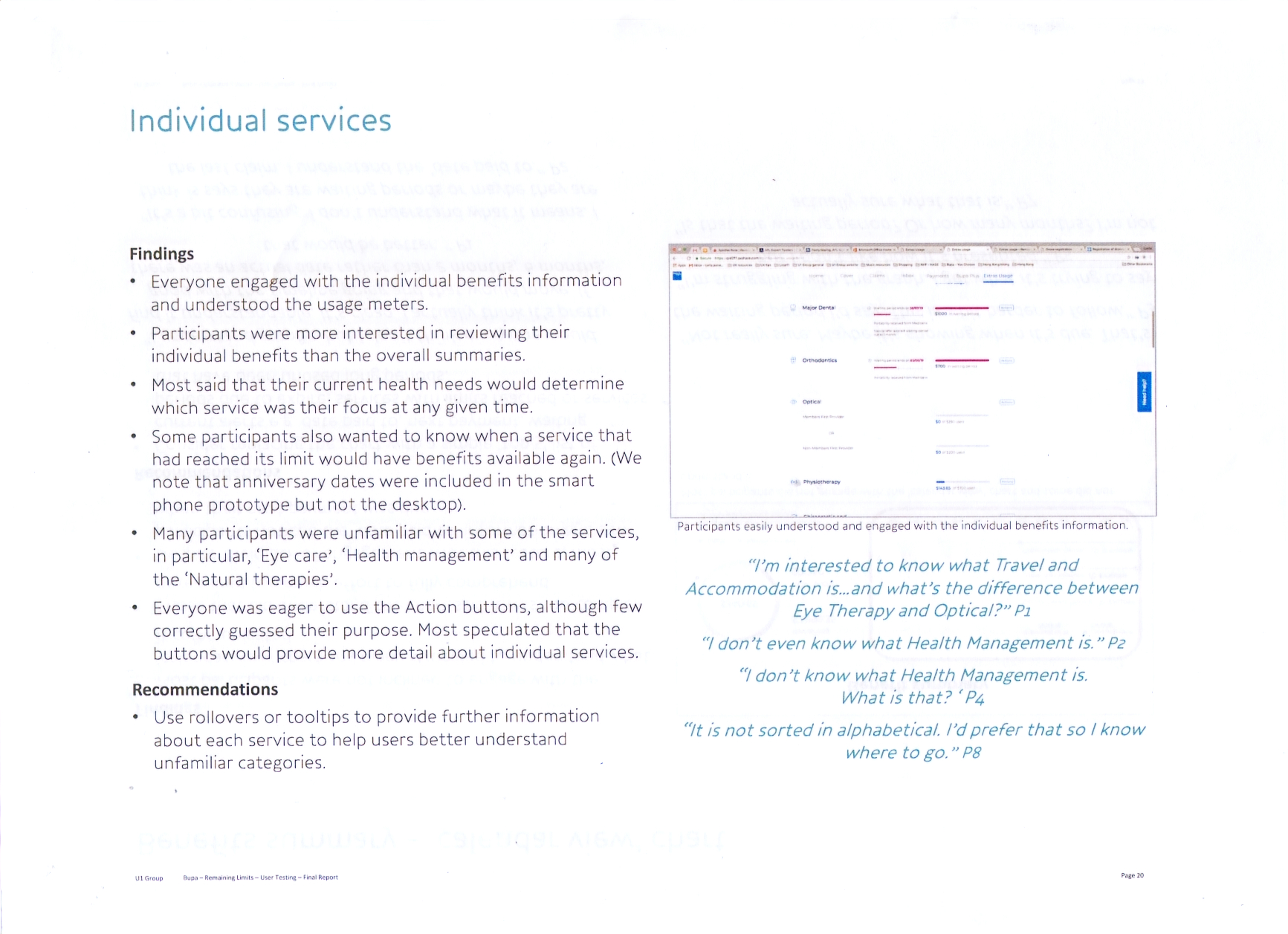
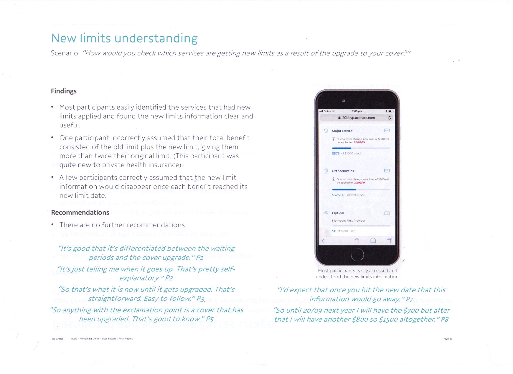
On August 2018 we conducted 8 user testing session at U1 research lab in Melbourne to explore the user experience of myBupa Extras usage prototype to understand user needs and to gauge user responses to proposed designs, flows, and functionality and content
The Challenge
The existing extras usage page had low user engagement. Users find the Information provided too complex and hard to understand. Instead of checking online, user relied on Product Disclosure Statement
The Solution
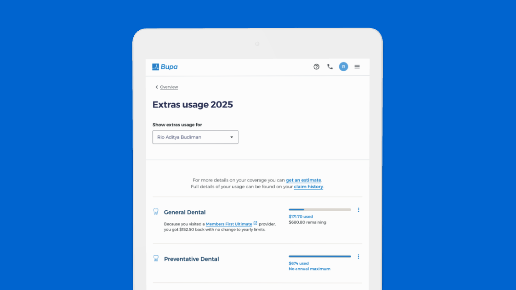
We redesigned the Extras usage experience with a focus on providing a real-time information on the level of cover they have in their Extras
My Role
Collaborated with lead designer and user researcher to get insights and recommendation to inform the direction of the extras usage project. This includes drafting moderation guide, designing high fidelity mockup, building UI prototype, and developer hand-offs
Tools & Methods
Project Impact & Key Metrics
91.9
SUS
System Usability Scale
62.5
NPS
Net Promoters Score
8.9
LTR
Likelihood to Recommend
User Research & Insights
"That is so much better than my previous experience of using the Bupa Website. It's more clear, you get more information. You can find a provider more easier. It's more simplistic and easier to understand and will definitely help you to get more out of your Extras."
"This is a lot better than going into a branch or ringing them up. It's much more informative. If it's real time it's there. All in front of you."
"This is more information and visibility. Definitely a lot better than reading a PDF which isn't particularly personalised."
Findings and Recommendations
Participants saw the prototype as an attractive, informative and much-improved alternative to currently available channels for tracking and managing their Extras usage. Participants also liked the real-time nature of the information and saw the potential for this tool to add value to the way they think about and use their Extras services.
Information Architecture
Based on learnings gathered from the study, we restructured the content hierarchy and app's navigation to surfaced real-time information on the current snapshot of Extras usage for individuals under the policy.
Interested in working together?
Let's discuss your next project and how I can help create meaningful digital experiences for your users.
Start a Conversation